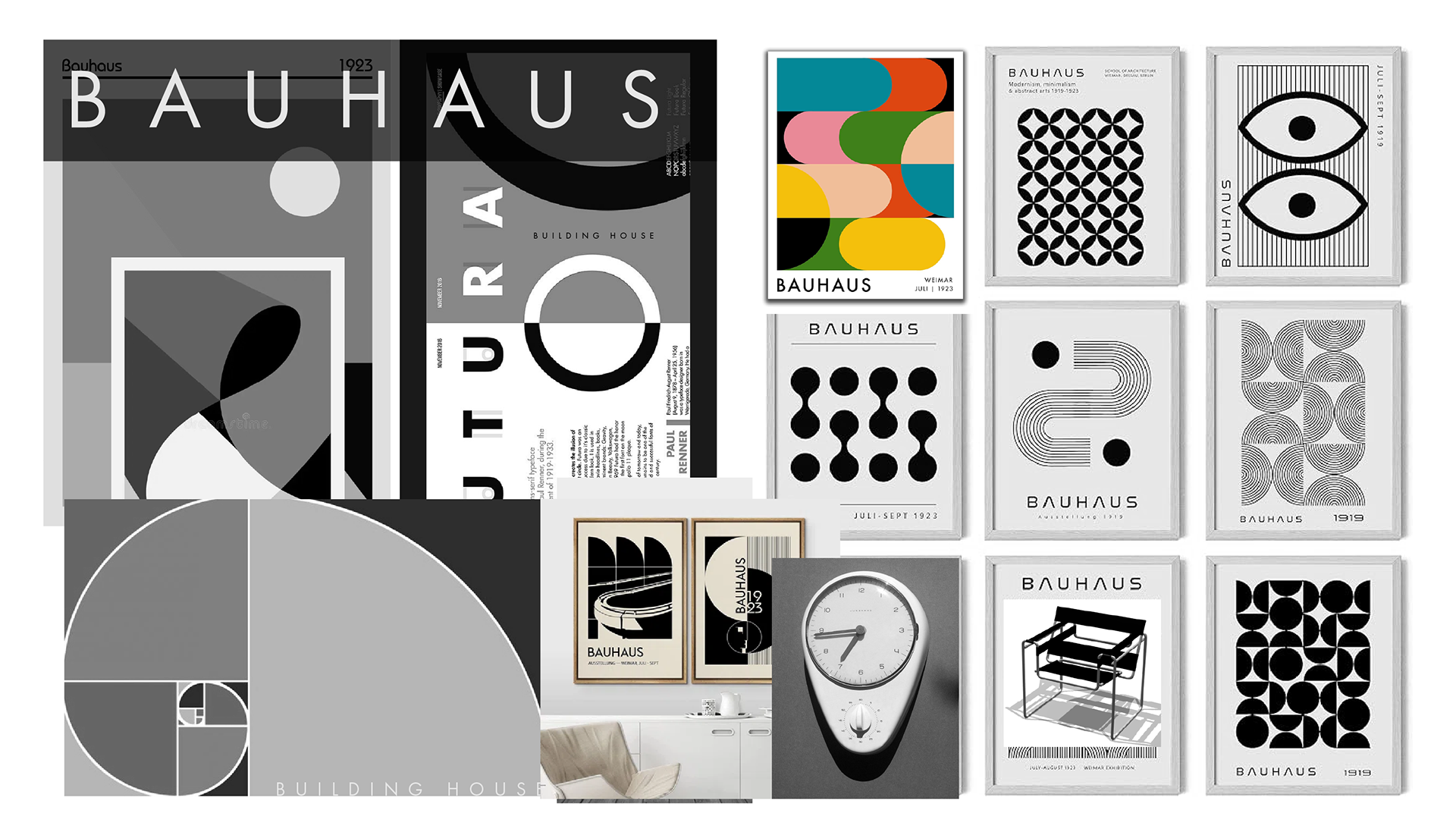
MOODBOARDS
Inspiration and Direction: They visually communicate the essence, style, and feel that the designer aims to capture in the logo. Moodboards help in setting the tone and aesthetic before any actual design work begins, ensuring everyone involved has a similar vision.
Collaboration Tool: Moodboards facilitate communication between the designer, the client, and other stakeholders. They provide a platform where ideas can be discussed, refined, or pivoted based on visual cues rather than abstract descriptions.
Exploration of Concepts: They allow for the exploration of different themes, colors, textures, and typography that could be integrated into the logo. This exploration helps in understanding what fits best with the brand's identity or product.
Reference Material: Moodboards act as a repository of inspirational images, fonts, color palettes, and perhaps other logos or design elements from which the designer can draw inspiration or directly incorporate elements.
Brand Identity Alignment: By collecting images and styles that resonate with the brand's values, target audience, and market positioning, moodboards help ensure that the final logo aligns well with the overall brand strategy.


Case Study: The Blantons - Real Estate Team
1. Business Overview:
The Blantons - Real Estate Team is a segment of OKLAHOME, offering premium real estate services aimed at homebuyers and investors with middle to upper-class incomes. The Blantons are an award winning husband/wife duo real estate team and one of the top producing realtors in the region.
2. Project Goal & Challenge:
The primary goal was to craft a bold, edgy yet sophisticated logo that fit seamlessly beside the OKLAHOME logo without overshadowing it, adhering to the parent company's branding rules. This logo needed to be versatile for use across digital ads, yard signs, and various collateral.
3. Target Audience:
The focus is on middle to upper-class homebuyers and investors who appreciate quality and sophistication in real estate services.
4. Previous Branding:
Before this project, there was a logo created on Canva by the client, which, due to its commonality, lacked uniqueness and impact. The team needed a professional touch to stand out.
5. Branding Changes:
The new branding centered around custom design inspired by Bauhaus principles, emphasizing simplicity, functionality, and visual impact. The logo was designed to reflect the team's ethos through a blend of modern art history and personal taste.
6. Implementation of New Identity:
The new brand identity was applied extensively in social media, yard signage, and all marketing collateral, ensuring a consistent and professional appearance across all touchpoints.
7. Launch Strategy:
The brand was rolled out mainly through social media platforms and the company website, allowing for immediate engagement with the existing audience.
8. Results:
The introduction of brand guidelines enabled clients to replicate the branding effectively, significantly enhancing brand awareness and consistency.
9. Feedback:
Feedback has been positive, with clients appreciating the design principles, ease of use, and how well the branding aligns with the target demographic's expectations.
10. Lessons Learned:
The key takeaway was the importance of truly listening to client needs rather than just hearing them, ensuring the brand reflects the vision and values of the business accurately.
Conclusion:
The Blantons - Real Estate Team successfully established a new brand identity that not only complements the parent company's branding but also stands out in the competitive real estate market. This project underscores the value of understanding client needs, applying historical design principles in a modern context, and maintaining brand consistency across various platforms, resulting in increased visibility and customer satisfaction.
